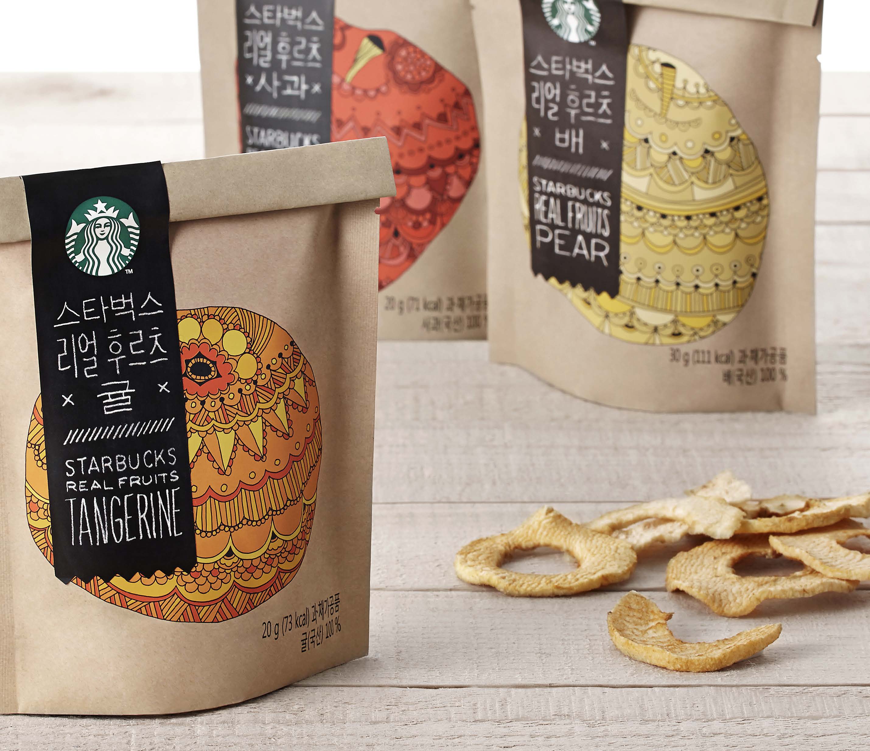
STARBUCKS KOREA / REAL FRUITS
Problem: Starbucks Real Fruits series is a set of packaging containing dried tangerine, apple, and pear.
For this project, we could not use a window due to a QA reason, nor a transparent container due to a high cost.
Another problem was, even though we were going for an economic option for the bag, the product itself was not inexpensive, and we had to come up with a way to make the bag look better than its naked self.
Solution: We decided to use illustrations; we deconstructed the shape in an unexpected way by using dots, lines, and patterns to bring out the beauty of the fruits. The colourful and decorative illustration allowed customers to imagine the flavor and expect the goodness, and it was also eye-catching from the shelf. The product title and accompanying text were laid out on a label with a chalk board texture. The label was diecut, and then was attached to the folded top part of the bag. This brought about the organic feel and handcrafted touch to the packaging and helped elevating the product value.
Scope: Packaging design
Launch date: June 2014
Client: Starbucks Korea


iF Design Award, 2016
Red Dot Communication Design Award, 2015
Pentawards, 2015
GD Good Design Korea, 2015
Red Dot Communication Design Award, 2015
Pentawards, 2015
GD Good Design Korea, 2015
©2014 Starbucks Coffee Company

