STARBUCKS KOREA / JUICE & YOGURT
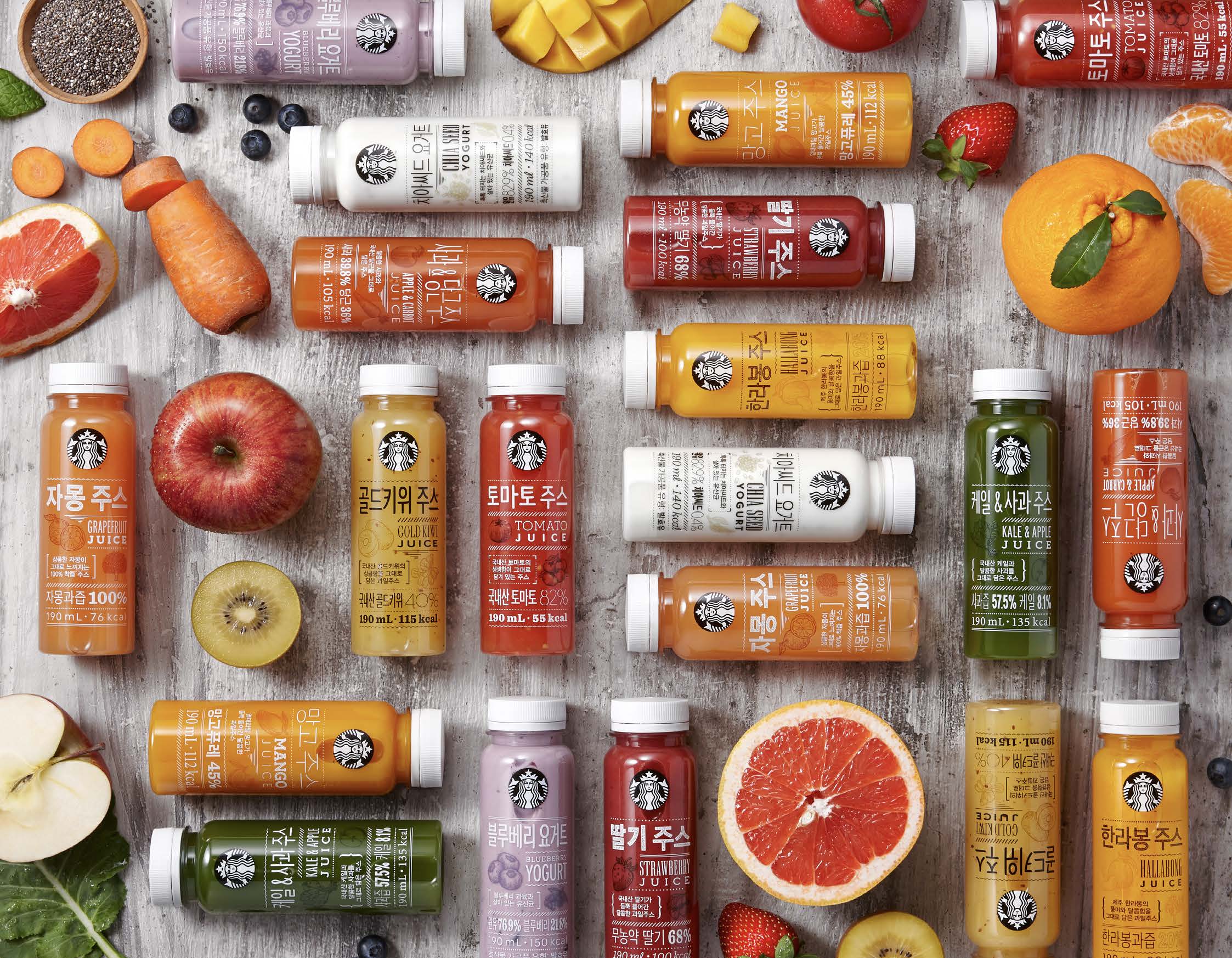
Design: Starbucks Coffee Korea's ready-to-drink is a healthy alternative for our customers, but the old packaging and its cute-y graphic style were not conveying its merits all that well.
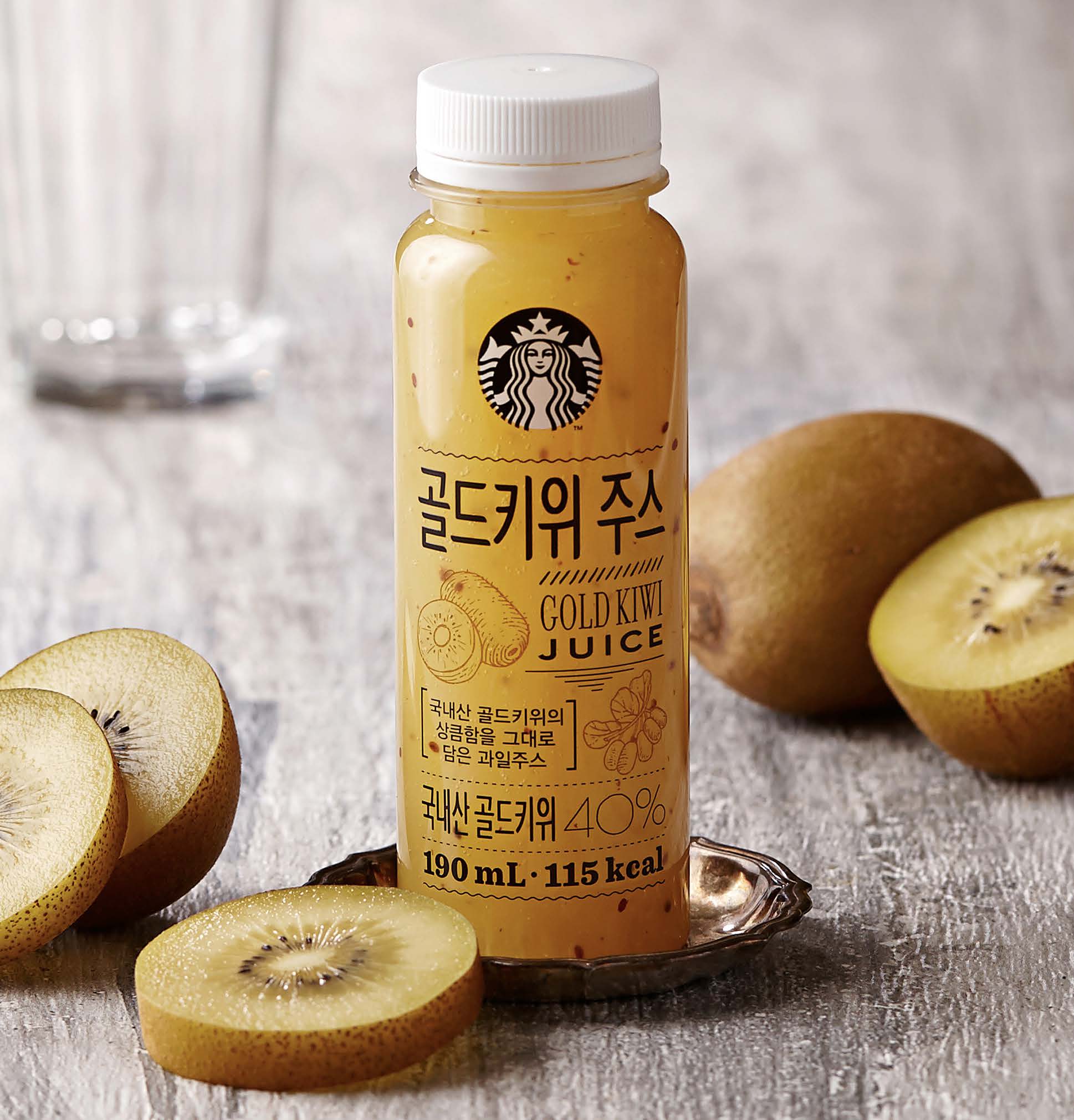
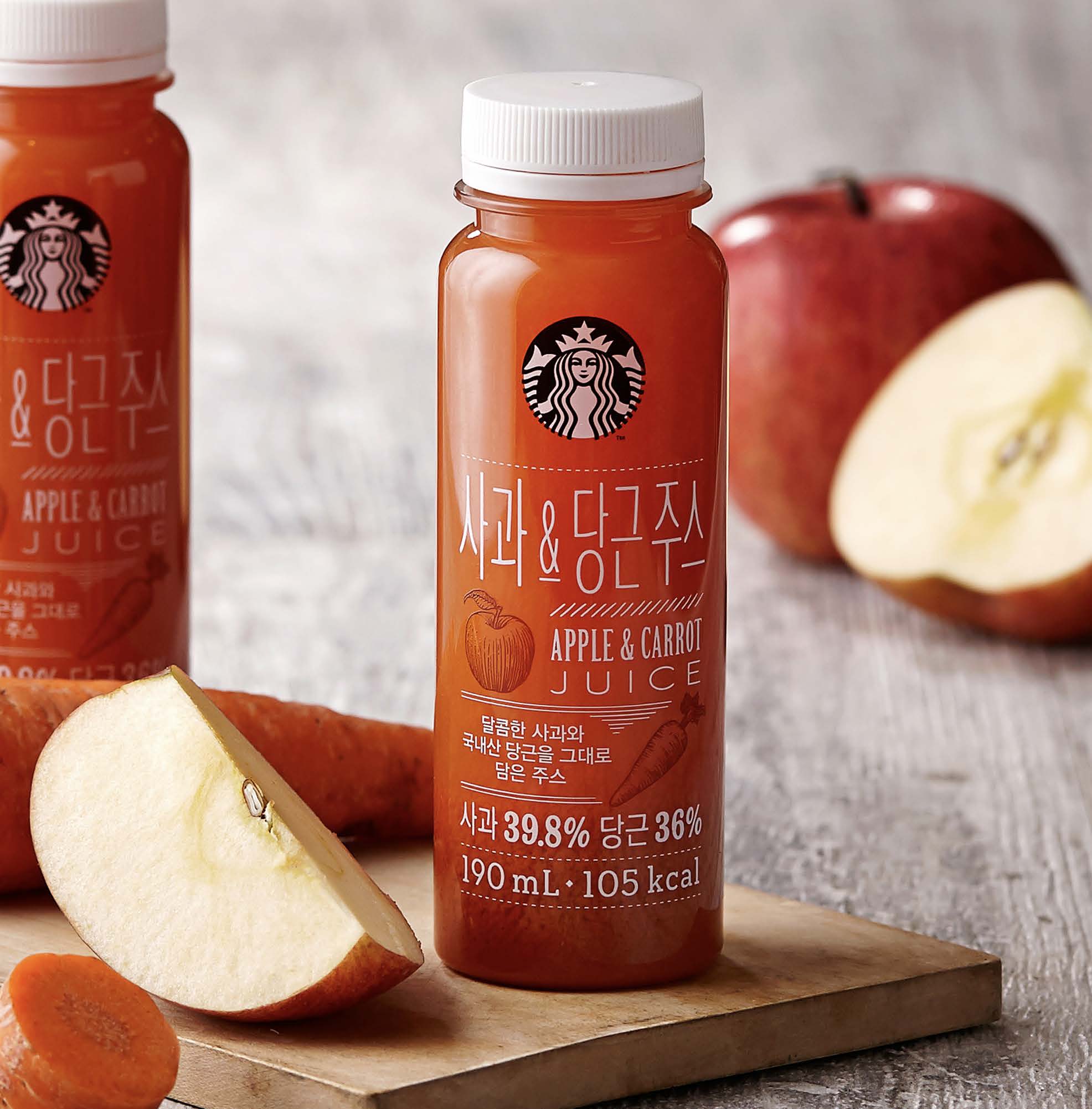
For the redesign, we decided to make the bottle slim and straight, moving away from the existing curvy shape. A slightly smaller diameter and taller body has an effect of making the bottle look significantly bigger, while resonating well with our sophisticated customers.
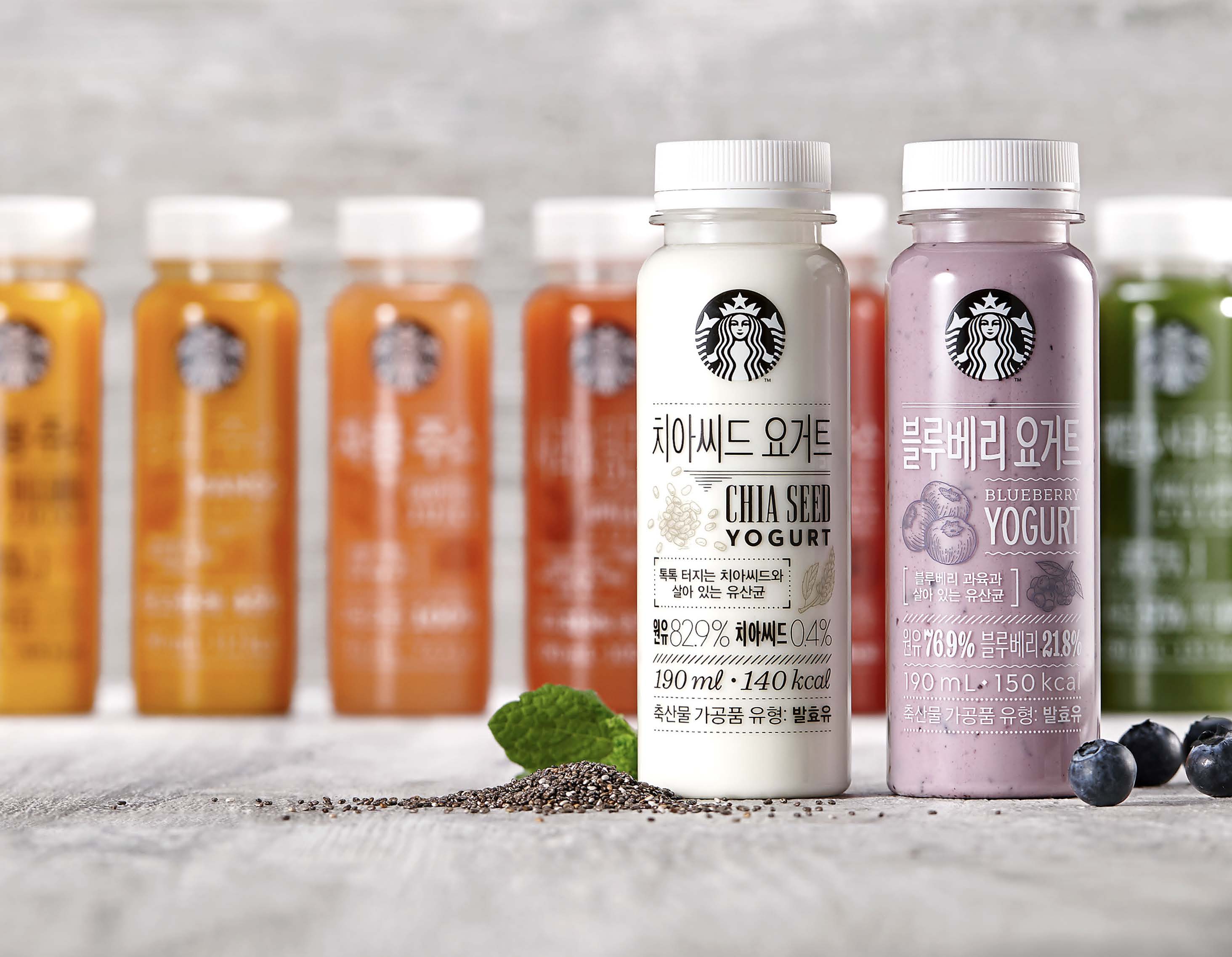
Typography-centric design jam-packed with information conveys the benefits of each drink. Both Korean and English copy is executed as a visual whole, and even the compulsory information such as ingredients, volume and calories come into play as a graphic element.
The handcrafted touch continues with varied graphics of each bottle – fonts and layouts change from bottle to bottle, but when lined up on the shelf, everything comes together as a big family.
Result: The redesign helped facilitating our RTD brand recognition, and the sales were up by 42%.
Scope: Illustration & Packaging design
Launch date: September 2015
Client: Starbucks Korea
Design: Starbucks Coffee Korea's ready-to-drink is a healthy alternative for our customers, but the old packaging and its cute-y graphic style were not conveying its merits all that well.
For the redesign, we decided to make the bottle slim and straight, moving away from the existing curvy shape. A slightly smaller diameter and taller body has an effect of making the bottle look significantly bigger, while resonating well with our sophisticated customers.
Typography-centric design jam-packed with information conveys the benefits of each drink. Both Korean and English copy is executed as a visual whole, and even the compulsory information such as ingredients, volume and calories come into play as a graphic element.
The handcrafted touch continues with varied graphics of each bottle – fonts and layouts change from bottle to bottle, but when lined up on the shelf, everything comes together as a big family.
Result: The redesign helped facilitating our RTD brand recognition, and the sales were up by 42%.
Scope: Illustration & Packaging design
Launch date: September 2015
Client: Starbucks Korea


iF Design Award, 2016
©2015 Starbucks Coffee Company